
Colour in the garden throughout the seasons is something we all want and try to plan for, however there’s more to colour in the garden than initially meets the eye. We all experience colour differently, and how we want to feel in our garden can be affected by what kind of plants, and therefore what colours, we surround ourselves with. All of our themes use some of these basic principles for combining and contrasting colours but they are very easy to apply to any garden.
Using the colour wheel for some inspiration, we can look at what hues compliment or contrast with each other.

Monochromatic schemes employ one colour with different variations. This can be used to emphasise texture and details such as foliage, bark, and flower forms. As there are not numerous colours to distract your eye you can focus on what makes each plant unique. This is a technique we use our theme, The Nordic, where we’ve included various white flowering perennials and grasses with similarities which, overall, created a calm and restful effect. This can be seen especially in the combination of Echinacea ‘White Swan’, Hydrangea and Selinum (Cow Parsley).

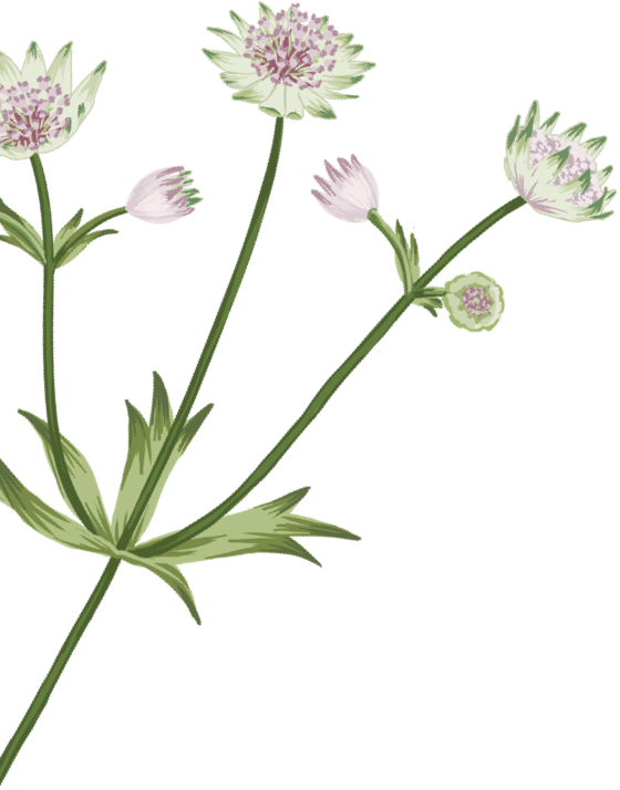
Paler colours, such as whites and light pinks, will brighten up a shady spot – for example, Astrantia ‘Alba’ and Geranium ‘White Ness’ which we include in our theme The Cottage.
Leaves can also come in handy when thinking about colour. Brunnera ‘Jack Frost’ is extremely versatile and the variegated leaves are ideal for creating interest in a shadier gardens with its flashes of white and a silvery sheen to every leaf.

Analogous or harmonious combinations use colours that lie next to each other on the colour wheel. They share similar pigments and usually blend in to one another creating a minimal contrast effect. This can create schemes that are elegant and calming when using ‘cooler’ colours such as blues and greys, and when used with ‘hot’ colours such as red and orange it can make a bright and cheery scheme.
Dig’s Theme The Mediterranean uses various grey, blue and purple colours, with plants such as a combination of Perovskia, Verbena and Helianthemum. Combinations of three usually work best, with one dominant colour supported by two softer ones.

Complimentary combinations use colours that are opposite one another on the wheel, with this contrast emphasising the different colours, catching your attention.
An example of complimentary colours is purple and yellow or orange and blue. Both opposites on the colour wheel. Our theme The Adventure uses this technique, creating a fun and lively theme that includes the purple of Echinacea purpurea alongside the soft, orange tone of Achillea ‘Terracotta’. This vibrancy attracts attention and draws one’s eye to certain areas. Cooler colours will naturally create a quiet, more relaxed spot. One can encourage Movement and the other encourages pausing or even sitting and can be a useful way to signify a transition to a quieter space in the garden.

Where whites and greens really brighten up a shady spot in the garden, bright colours look great in full sun. Plants such as Rudbeckia create what can almost appear to be a ray of sunshine within the garden when the light is on them. This vibrancy can also make them appear closer to you and so is ideal for making a bold statement. On the flip side, cooler colours will create an appearance of distance and depth. This is ideal for smaller, courtyard gardens where lighter colours can give the impression of a garden bigger than it actually is.
Repeating certain colours like green, or indeed even textures, such as a grass like Stipa tenuissima, is a great way to link plants too to create a harmonious and balanced scheme. Utilising a textural grass such as Stipa with more neutral tones can also help to bring down the brightness of an adjacent perennial (such as Kniphofia).

Whilst it may seem like there are many are rules or guidelines, ultimately the way you use colour in your garden is totally personal dependent on how you want to feel, experience and use your garden. As long as you’re planting something that will thrive in that spot, then it can be fun to experiment with colours and textures, and be creative and fun with it.